To boldly decide where no one has had the insight before.
When we started Cliffhanger, our mission statement was “Delivering more than maps,” which we did, by providing the best mapping experience available at the time. And while this was true at the time (and we believe it still is), our updated mission statement reflects better how we as a company have evolved. We’ve moved beyond mapping, which is now a commodity, into other types of data visualizations (charts, graphs, diagrams, VR, AR, etc.). And beyond that, we have moved into analytics, which is only the next logical step.
The logo
At meetings, trade shows or other gatherings we frequently get asked about our company logo. This is our story:
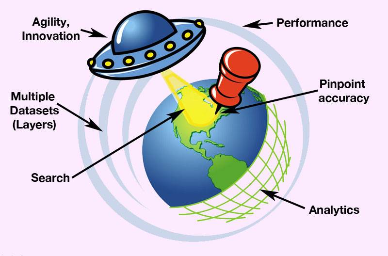
We think the logo speaks for itself. Multiple aspects of where we stand for in a company are reflected in our logo: Search, Analytics, Performance, Agility, Innovation, etc. A few examples:
- We never sacrifice performance, shown by the outer ring. If we “have to” release a feature that we’re not 100% satisfied with performance wise, it stays in “beta” until it meets our requirements.
- Analytics is to examine existing data with the goal of discovering or revealing new insight. The grid on the logo represents this by peeling away bits of data.
- UFO’s, as opposed to airplanes, can move seemingly in any direction (=agile) using a Sci-Fi mode of propulsion (=innovation).
- The pin and the search light speak for itself.
Like icons in applications, logos are a graphic representation of a company. Make it count!