Are you still using Excel to create reports? If so, then continue reading.
To show how it works, we show you how to create a “cables installed per month” dashboard. The dashboard is always real time and interactive, saving you lots of time preparing your data.
We created a real time interactive dashboard that no Excel spread sheet can match: Users can click on any part of the dashboard to explore, search or narrow down data. And this is where the interactive part comes in: when you interact with 1 part of the dashboard, all the other parts instantly update. For example, in the dashboard below we show monthly cables installed. By zooming into just 1 year (or 1 month) all the other elements, such as total wire length, will instantly update. You can select multiple additional filters, such as only show Underground” & “Copper, ” and everything will update. Forget about copy and paste raw data into Excel and then spend hours to create presentable reports. Just build a dashboard and then save it for later retrieval. And since there is a live connection to your data, you don’t have to waste time copying data.
See video here: analytics in action.
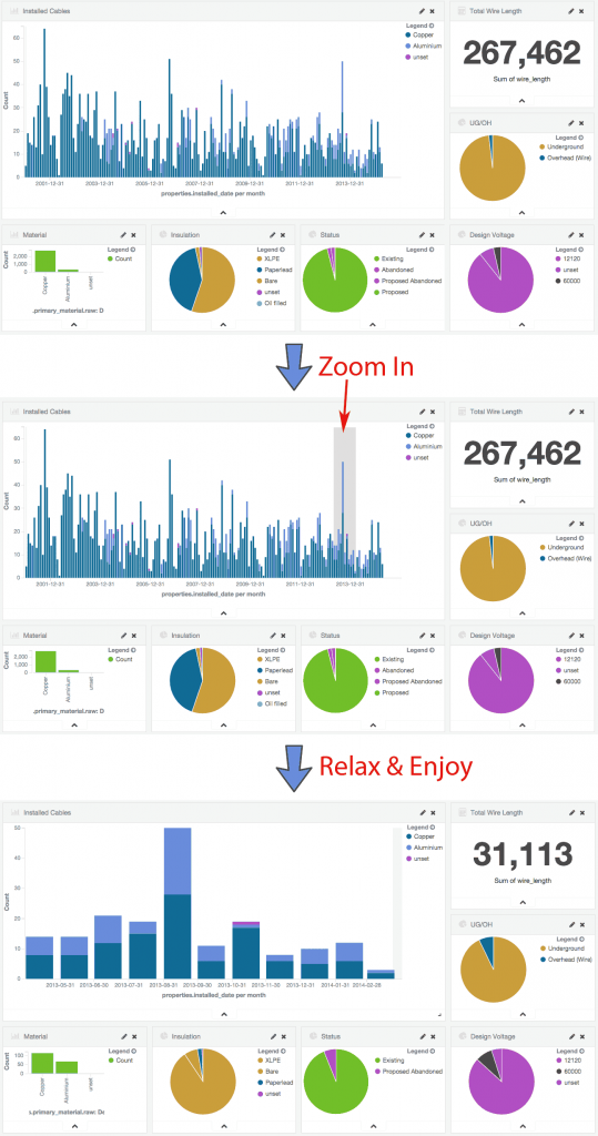
Image: Combining the speed of search with the power of analytics changes your relationship with your data. Interactively search, discover, and analyze to gain insights that improve your processes and streamline your operations.
Your business analysts will be happy.