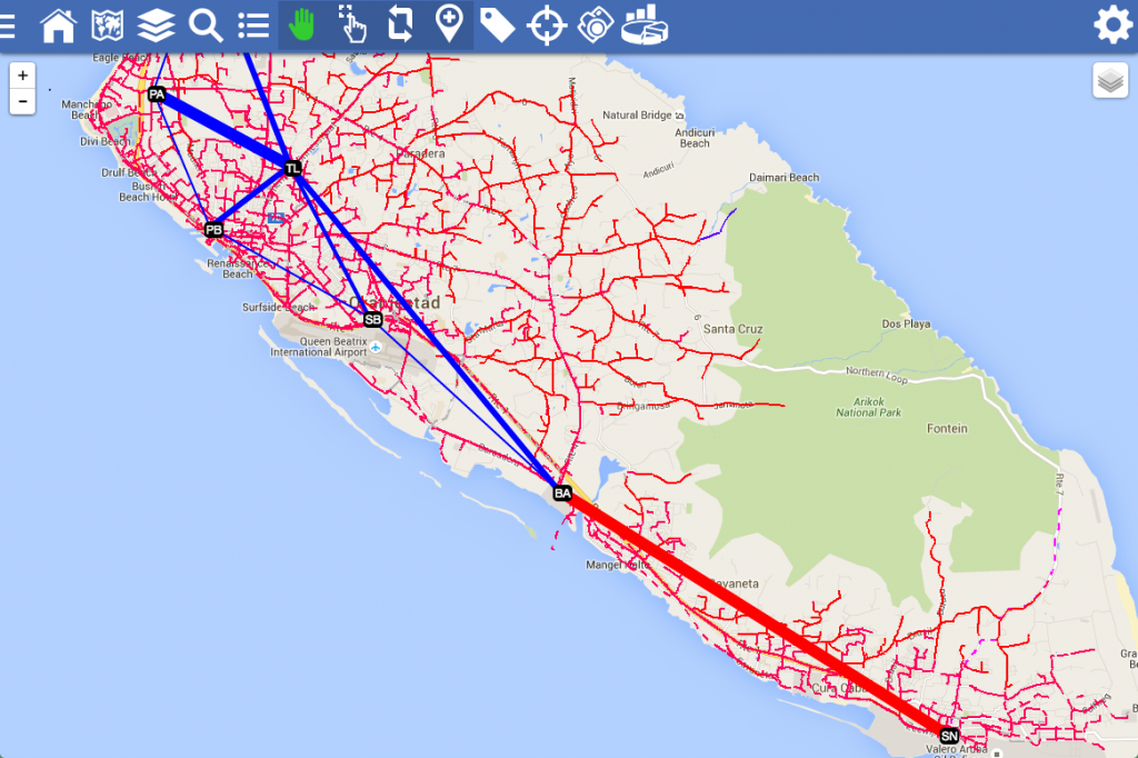
Utilities generate an incredible amount of data on a daily basis: smart meters, sensor data, and even server logs. So much data being produced that it is virtually impossible, for a human, to make sense of this data in a timely manner. Our analytics engine takes this data and allows you to transition from hard-to-read tabular data to easy to interpret graphs, charts, diagrams, and maps. The screenshots illustrate this: smart diagrams are interactive, allowing the user to filter data quickly. And smart maps visualize data that is much easier to read than tabular terminal data from sensors.